Monday, August 25, 2008
Averages and strike rates in ODI's
Rating batsmen in one-day cricket is difficult because both average and strike rate are important, and it's not clear how they should be weighted.
I can't see a theoretical solution (multiplying the two measures might be good enough, but it seems arbitrary), and I think that the actual answer will come from simulations. In this post, I show some results from some woefully inaccurate simulations. But hopefully even though the total scores were below what they should be, the equivalences of various averages and strike rates should be reasonably accurate.
Here's what I did. I took the overall average and strike rate since 2000 for each batting position (I think using the top eight teams). I ran a largish number (20000) simulations to get what the "average" total score is, and it turned out to be 208 (I told you it was inaccurate...).
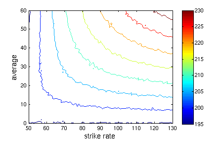
Then, I replaced one of the openers with a batsman with an average of 1, strike rate 50, then average 2, strike rate 50, average 3, strike rate 50, and so on, doing 20000 simulations each time to get the average total score. I did this until I had a grid of average total scores for strike rates from 50 to 130, and averages from 1 to 60. Then I made contour plots with curves of equal value.
The simulations assumed a constant run rate and exponentially distributed scores. Not realistic, but it was straightforward to do and avoided doing ball-by-ball simulations.
There's a bit of noise in the results. Here's the contour plot for openers:
The number 3:
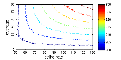
The number 4:
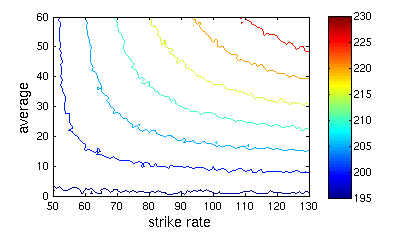
Because I was exceedingly lazy, the contours in the separate plots may not correspond to the same total team scores. But you will agree that the pictures are colourful.
Now for some numbers. In each of the following little tables, the rows are equivalent. So, an opener with an average of 50 and a strike rate of 73 is worth the same as an opener with an average of 25 and a strike rate of 101. According to the simulations, at least.
Making an average score of 210, as an opener:
210, number 3:
210, number 4:
I didn't get past number 4. I'll do the rest tomorrow.
I imagine that the curves would change with more accurate simulations, but this is at least a start.
I can't see a theoretical solution (multiplying the two measures might be good enough, but it seems arbitrary), and I think that the actual answer will come from simulations. In this post, I show some results from some woefully inaccurate simulations. But hopefully even though the total scores were below what they should be, the equivalences of various averages and strike rates should be reasonably accurate.
Here's what I did. I took the overall average and strike rate since 2000 for each batting position (I think using the top eight teams). I ran a largish number (20000) simulations to get what the "average" total score is, and it turned out to be 208 (I told you it was inaccurate...).
Then, I replaced one of the openers with a batsman with an average of 1, strike rate 50, then average 2, strike rate 50, average 3, strike rate 50, and so on, doing 20000 simulations each time to get the average total score. I did this until I had a grid of average total scores for strike rates from 50 to 130, and averages from 1 to 60. Then I made contour plots with curves of equal value.
The simulations assumed a constant run rate and exponentially distributed scores. Not realistic, but it was straightforward to do and avoided doing ball-by-ball simulations.
There's a bit of noise in the results. Here's the contour plot for openers:

The number 3:

The number 4:

Because I was exceedingly lazy, the contours in the separate plots may not correspond to the same total team scores. But you will agree that the pictures are colourful.
Now for some numbers. In each of the following little tables, the rows are equivalent. So, an opener with an average of 50 and a strike rate of 73 is worth the same as an opener with an average of 25 and a strike rate of 101. According to the simulations, at least.
Making an average score of 210, as an opener:
avg  sr
50   73
45   74
40   76
35   80
30   87
25   101
210, number 3:
avg  sr
50   69
45   71
40   73
35   76
30   82
25   96
210, number 4:
avg  sr
50   72
45   75
40   77
35   82
30   90
25   110
I didn't get past number 4. I'll do the rest tomorrow.
I imagine that the curves would change with more accurate simulations, but this is at least a start.
Sunday, August 24, 2008
Non-boundary strike rates
Near the end of the discussion here, there's a comment from me about the changing nature of the way runs are scored in ODI cricket. Most of it, of course, is coming from boundaries, which are much more common today. But it is interesting that there's been no real changes in the rate of non-boundary scoring since 1990.
Here's a graph showing the yearly overall "non-boundary strike rate", that is the runs that are actually run, divided by the number of balls not hit to the boundary (times 100). Top eight sides only. (There's some missing boundary data, especially before 1990. The actual non-boundary strike rates for these years are lower than those in the graph.)
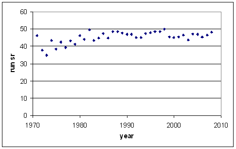
(I've called it "run sr" in the graph, run as in running.)
I would have thought that batsmen today are more adept at "milking" bowlers, but the non-boundary strike rate has never got above 3 runs per over for any long period.
If you suppose that there are three types of balls:
- good balls that can't be scored off
- OK balls that can be worked around
- bad balls that can be hit to the boundary
thenit seems that batsmen these days are able to hit the OK balls to the boundary more often, but can't do much about the good balls. (Edit: No, wait, that's not right. They're getting better at milking the good balls at the same rate as they're getting better at hitting the OK balls for four. Roughly. The constant non-boundary strike rate with an increased frequency of boundaries means that the percentage of dot balls is getting lower.)
At a team level (now including all teams, since 2000, but I've forgotten what I did with Kenya, probably I discarded them because they play against minnows too often):
Bangladesh are really bad at working the ball around for singles, etc. There's a clear gap between Australia and Sri Lanka, then a gradual progression down through to Zimbabwe. Then there's a huge dropoff to Bangladesh.
India are a bit of an anomaly, with their high overall strike rate coming more heavily from boundaries than the other teams. It's probably not just a factor of their grounds — opposition teams in India have the highest non-boundary strike rate of away teams anywhere.
Top eight sides since 2000, individuals, average at least 30, at least 1000 runs.
Symonds and Dhoni are best known for their hitting, but they're good at the less flashy stuff as well.
Unhonourable mention goes to Chris Gayle: overall strike rate of 80.3, non-boundary strike rate of 37.3, lowest of all the players who made the qualification. Lazy.
Here's a graph showing the yearly overall "non-boundary strike rate", that is the runs that are actually run, divided by the number of balls not hit to the boundary (times 100). Top eight sides only. (There's some missing boundary data, especially before 1990. The actual non-boundary strike rates for these years are lower than those in the graph.)

(I've called it "run sr" in the graph, run as in running.)
I would have thought that batsmen today are more adept at "milking" bowlers, but the non-boundary strike rate has never got above 3 runs per over for any long period.
If you suppose that there are three types of balls:
- good balls that can't be scored off
- OK balls that can be worked around
- bad balls that can be hit to the boundary
then
At a team level (now including all teams, since 2000, but I've forgotten what I did with Kenya, probably I discarded them because they play against minnows too often):
team          sr    run sr
Australia     83.6  50.6
Sri Lanka     75.5  47.4
South Africa  78.3  47.0
Pakistan      77.3  46.7
India         78.8  45.7
England       74.4  45.4
New Zealand   75.2  44.7
West Indies   74.2  43.9
Zimbabwe      67.0  43.3
Bangladesh    63.4  38.6
Bangladesh are really bad at working the ball around for singles, etc. There's a clear gap between Australia and Sri Lanka, then a gradual progression down through to Zimbabwe. Then there's a huge dropoff to Bangladesh.
India are a bit of an anomaly, with their high overall strike rate coming more heavily from boundaries than the other teams. It's probably not just a factor of their grounds — opposition teams in India have the highest non-boundary strike rate of away teams anywhere.
Top eight sides since 2000, individuals, average at least 30, at least 1000 runs.
Player          mats  inns  runs  avg   sr    run sr  diff
JN Rhodes       71    66    1994  41.5  86.1  59.7    26.3
DS Lehmann      44    39    1219  42.0  78.8  56.0    22.8
MEK Hussey      77    60    2079  54.7  85.6  55.3    30.4
L Klusener      91    73    1592  33.9  87.6  54.9    32.7
A Symonds       157   133   4300  40.2  94.1  54.1    40.1
MJ Clarke       117   105   3486  42.5  81.0  53.9    27.2
MS Dhoni        101   91    3064  44.4  89.0  53.6    35.5
SR Waugh        46    38    1134  40.5  79.9  52.6    27.2
PD Collingwood  124   114   2956  31.1  74.6  51.5    23.1
RP Arnold       136   123   2984  32.8  72.1  51.5    20.6
Symonds and Dhoni are best known for their hitting, but they're good at the less flashy stuff as well.
Unhonourable mention goes to Chris Gayle: overall strike rate of 80.3, non-boundary strike rate of 37.3, lowest of all the players who made the qualification. Lazy.
Wednesday, August 13, 2008
Bowlers as they get more experienced
There was a comment from Gary Naylor here saying that Monty Panesar should improve on his average of 32 as his career goes on, since he'll learn more about how to bowl.
I'm not convinced. I took all spinners with 149 or more wickets since WWII, and found split their wickets into which Test it was in their careers, so I could find the overall average in debut Tests, second Tests, third Tests, etc.
To get rid of some noise I actually took a five-Test moving average, so the first data point in the graph below is the overall average in the spinners' first to fifth Tests, the next the average in their second to sixth Tests, etc.
Also I weighted wickets by the average of the batsmen dismissed.
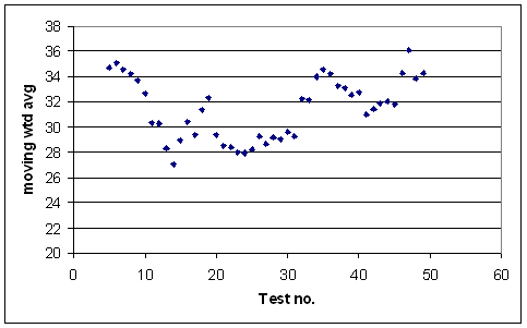
Note that there's a bit of a selection effect going on. I'm only looking at spinners who were good enough to play enough Tests to take 149+ wickets. Towards the right-hand end of the graph this is also a factor — if you imagine it continuing further on out, you'd eventually just be plotting Warne, Murali, and Kumble. There are, for those interested, 24 bowlers going into Tests 1-36, then 23 in Test 37, 22 in Tests 38-43, 20 in Test 44, 19 in Tests 45 and 46, and 18 in Tests 47-49.
I don't know how much I want to read into the graph, though I'm happy in saying that spinners improve after their first ten Tests or so. After that there may or may not be a trend — batsmen working them out? Certainly there's no strong evidence that Panesar will improve significantly (he's played 33 Tests), though of course it's possible.
Here's the corresponding graph for pacemen:
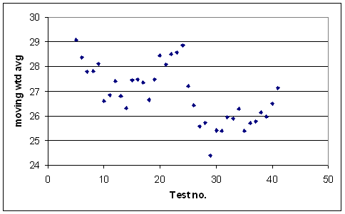
There are 46 bowlers going into all of those data points. There's a downward trend — pacemen tend to get better with experience, at least for a few dozen Tests.
One thing to try in future is age rather than Test experience. The people who've done this sort of analysis in baseball say that age is a better thing to use than Major League experience. But of course baseball is not cricket, so I'm not sure what will come out of it.
I'm not convinced. I took all spinners with 149 or more wickets since WWII, and found split their wickets into which Test it was in their careers, so I could find the overall average in debut Tests, second Tests, third Tests, etc.
To get rid of some noise I actually took a five-Test moving average, so the first data point in the graph below is the overall average in the spinners' first to fifth Tests, the next the average in their second to sixth Tests, etc.
Also I weighted wickets by the average of the batsmen dismissed.

Note that there's a bit of a selection effect going on. I'm only looking at spinners who were good enough to play enough Tests to take 149+ wickets. Towards the right-hand end of the graph this is also a factor — if you imagine it continuing further on out, you'd eventually just be plotting Warne, Murali, and Kumble. There are, for those interested, 24 bowlers going into Tests 1-36, then 23 in Test 37, 22 in Tests 38-43, 20 in Test 44, 19 in Tests 45 and 46, and 18 in Tests 47-49.
I don't know how much I want to read into the graph, though I'm happy in saying that spinners improve after their first ten Tests or so. After that there may or may not be a trend — batsmen working them out? Certainly there's no strong evidence that Panesar will improve significantly (he's played 33 Tests), though of course it's possible.
Here's the corresponding graph for pacemen:

There are 46 bowlers going into all of those data points. There's a downward trend — pacemen tend to get better with experience, at least for a few dozen Tests.
One thing to try in future is age rather than Test experience. The people who've done this sort of analysis in baseball say that age is a better thing to use than Major League experience. But of course baseball is not cricket, so I'm not sure what will come out of it.
Wednesday, August 06, 2008
The modern lack of tour games
People often complain (myself included!) about the lack of tour matches these days.
Here's a breakdown of home side victories by Test number in the series (excl. Bangladesh and Zimbabwe):
1st: 0.40 +/- 0.02
2nd: 0.38 +/- 0.02
3rd: 0.38 +/- 0.02
4th: 0.39 +/- 0.03
5th: 0.39 +/- 0.04
6th: 0.35 +/- 0.12
That's over all Test history. There might be an extra slight advantage for the home side in the first Test of a series, but it's within error bars. But perhaps that small advantage is due to a bigger advantage that's come about recently? Here are the numbers since 2000:
1st: 0.42 +/- 0.05
2nd: 0.46 +/- 0.05
3rd: 0.50 +/- 0.06
4th: 0.55 +/- 0.11
5th: 0.60 +/- 0.15
That it's such a neat little increasing sequence is probably luck. That the home side is winning more Tests is not surprising, since we're in a very result-heavy era. But the main point to take home is that there's no evidence that touring teams get better as they get more used to the foreign conditions or whatever. Perhaps those stingy boards are right not to schedule extra tour matches.
This is a result that surprised me.
Subscribe to Posts [Atom]